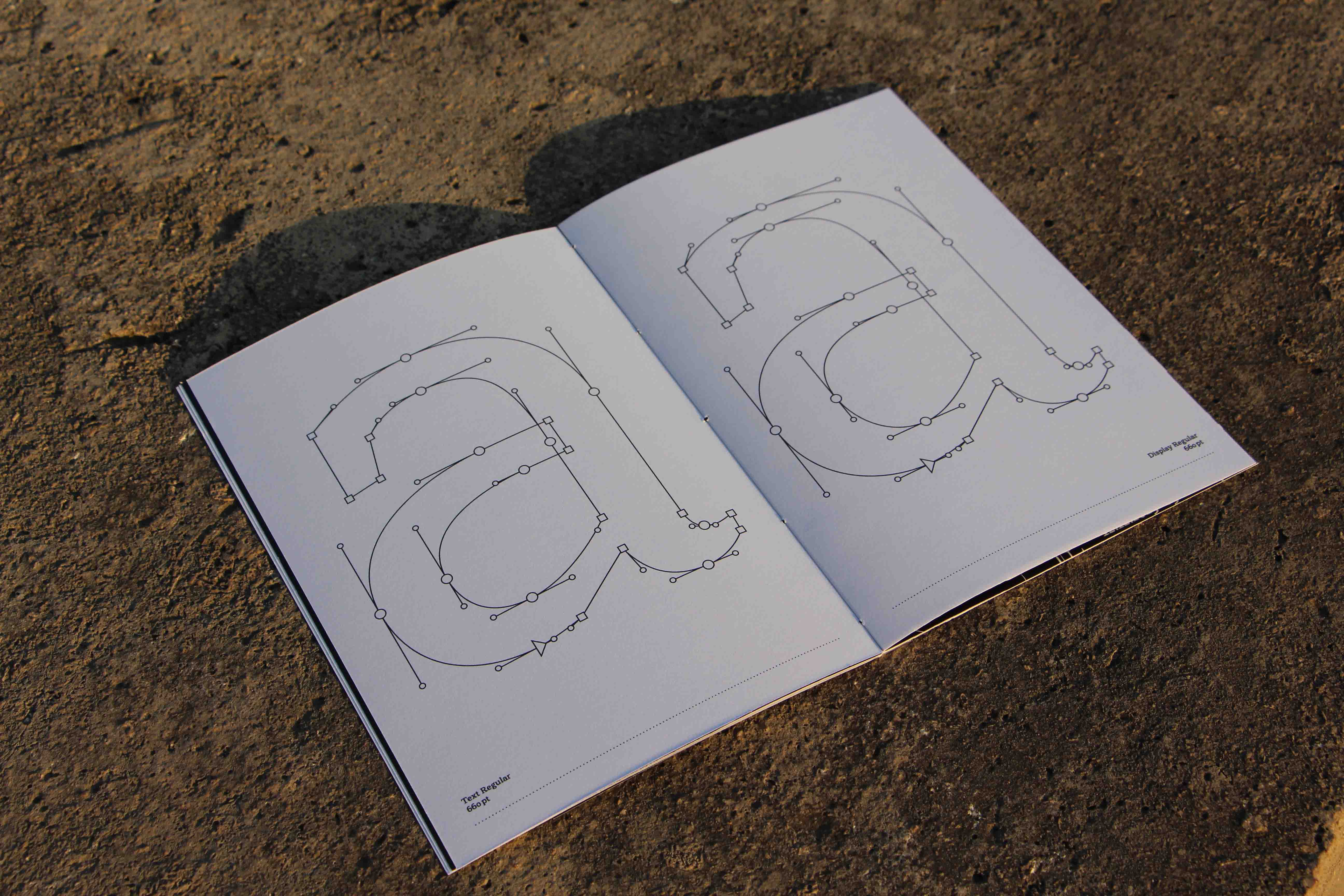
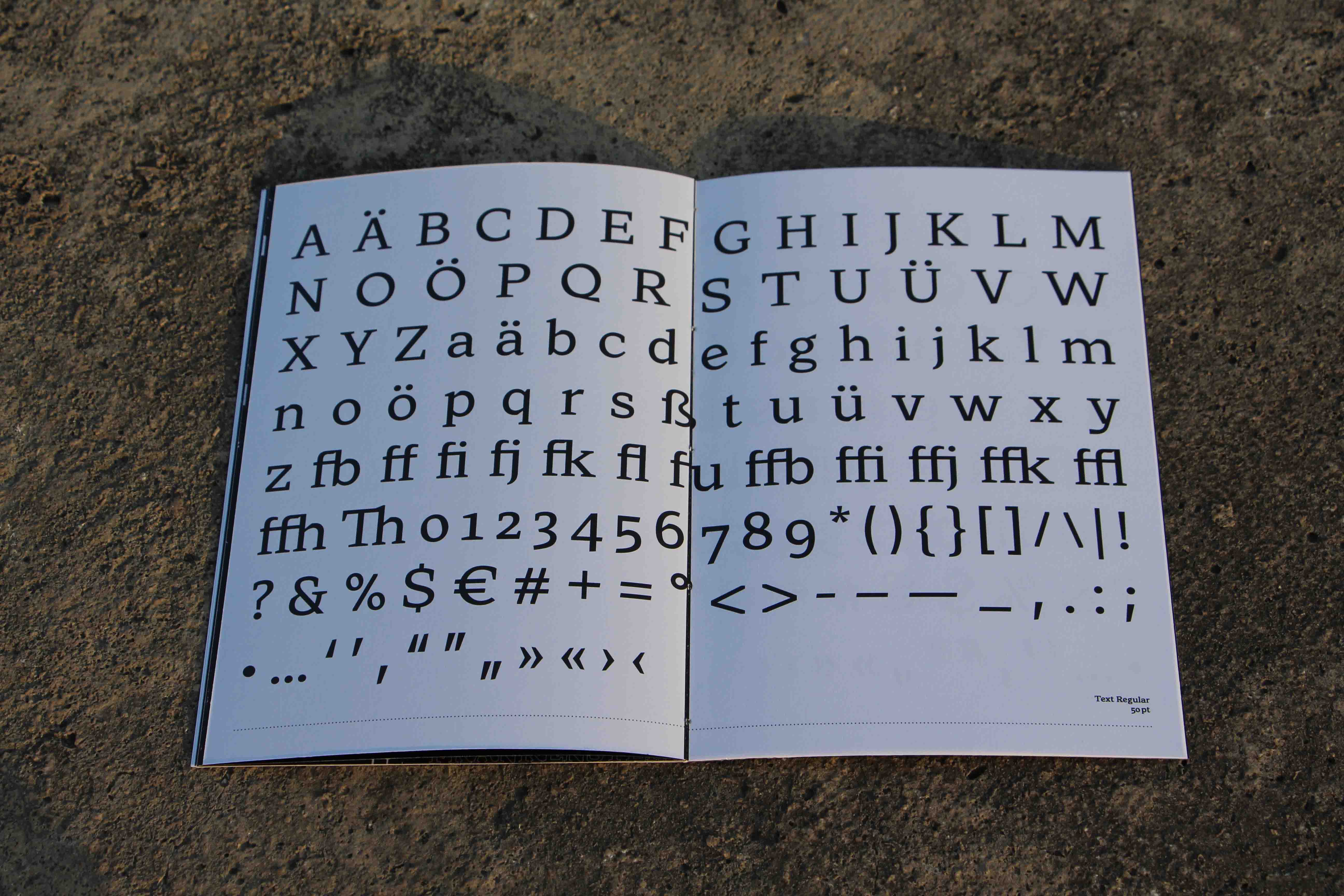
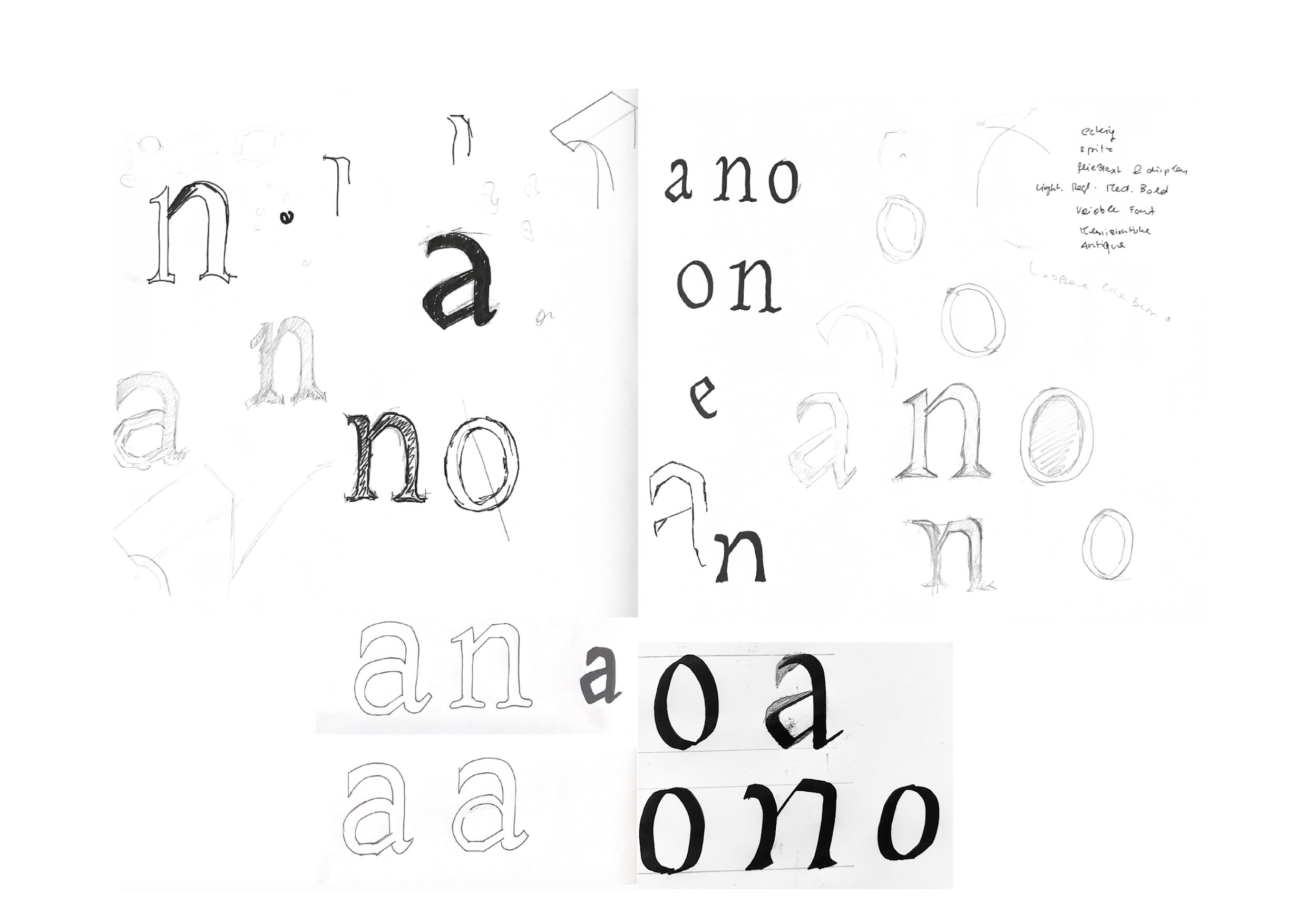
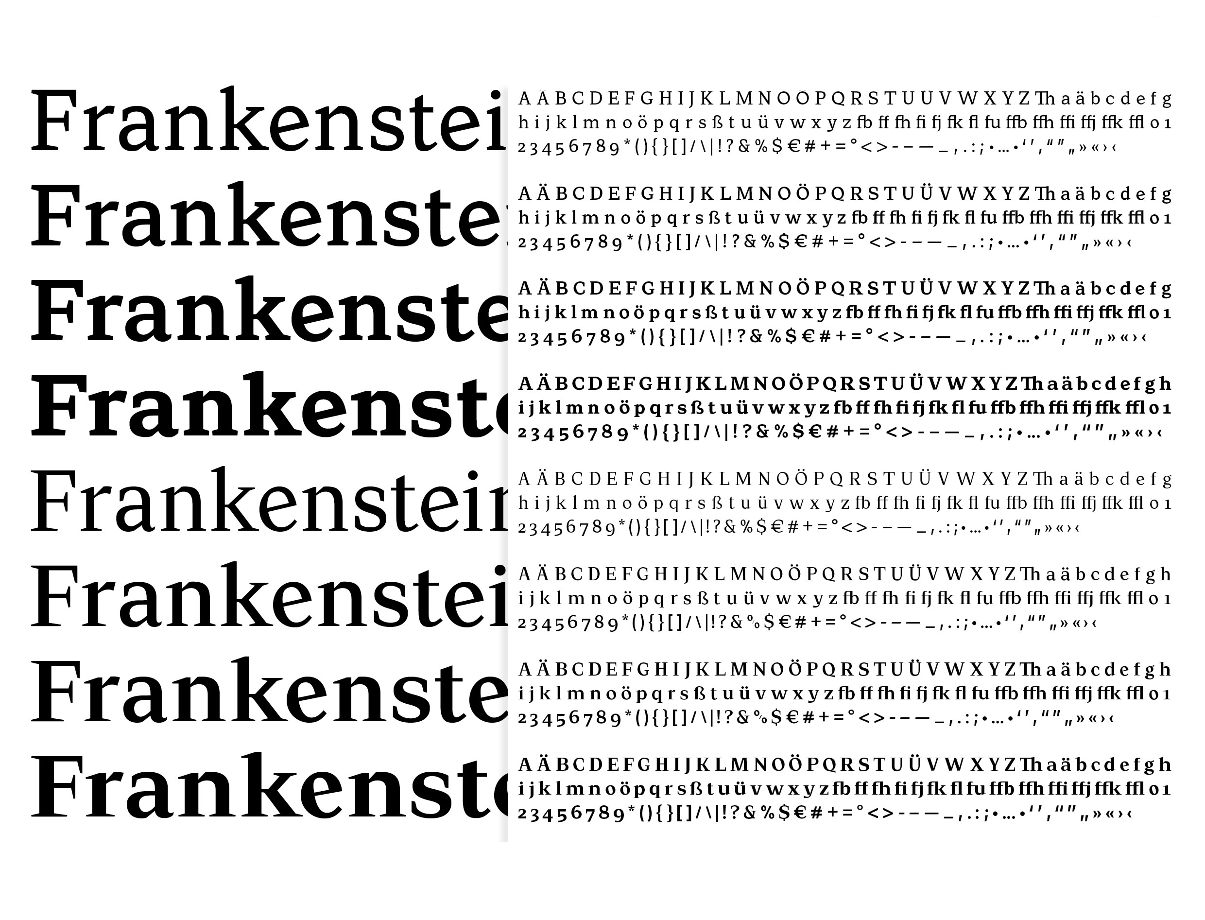
As part of the compulsory elective subject, I planned, designed and technically implemented a small font family using the Glyphs programme. The themes available for the project were Frankenstein or Mary Shelley’s modern Prometheus. The resulting fonts could be used by the students of the publication design elective in their projects. My reading experience with the novel was rather negative. The resulting goal was to incorporate this feeling into the design in order to express the loneliness of the monster and the fear of Victor Frankenstein. The use of angular serifs emphasises the negatively charged emotional world of the characters. The deep and complex emotions of the novel, expressed through the typographic forms, should leave room for personal interpretation. The possibility of reflecting the hidden pain and inner turmoil through the typeface was particularly appealing. The way in which the basic theme of isolation and horror is emphasised through the design is intended to open up and intensify different perspectives. I have drawn a small font family called twinge, which is made up of a total of eight weights (text and display). The text and display always consist of a Regular and a Bold, between which two further weights were interpolated (Regular, Medium, SemiBold, Bold). This approach allowed the font family to be used particularly well in publication design.
| Typedesign |
| New Design University |
| 2023 |


